Your chatbot interface is the first thing customers see when they need help. A poorly designed chatbot UI drives visitors away fast. The best chatbot UI examples make conversations feel natural and guide users to quick solutions.
Most chatbots fail because of bad UI, not weak AI. When the interface confuses users or feels clunky on mobile, they leave. That’s why studying successful chatbot UI examples matters.
This guide breaks down 15 real chatbot UI examples from top brands. You’ll see what works and why it works. You’ll also learn how to copy these patterns on your own site. Best of all, you won’t need to hire a design team.
Quick Comparison: Chatbot UI Styles At A Glance
| Brand | Industry | Key UI Feature | Best For |
|---|---|---|---|
| Domino’s | Food | Product carousel with photos | Visual menu browsing |
| PayPal | Finance | Guided question flow | Self-service support |
| Notion | Productivity | Minimal design with icon prompts | Task automation |
| ChatGPT | AI Assistant | White space with suggested prompts | Multi-purpose tasks |
| Meta AI | Social Media | Cross-platform consistency | Instagram & WhatsApp users |
| Bank of America | Finance | Voice + text dual input | Accessible banking |
| Home Depot | Retail | Prioritized menu options | Order support |
| Redfin | Real Estate | Property listings with CTAs | Homebuyer assistance |
| Expedia | Travel | Personalized greetings | Trip management |
| GoHenry | Finance | Bright colors and animations | Kids financial education |
| ClickUp | Productivity | Task-focused prompts | Workflow automation |
| Slackbot | Communication | Command shortcuts | Team collaboration |
| Flo | Health | Empathetic personalization | Health tracking |
| Snapchat | Social Media | Creative prompt generation | Visual content ideas |
| Canva | Design | Step-by-step feature guidance | Design assistance |
Table of Contents
- Why Chatbot UI Design Matters More Than You Think
- What Elements Are Found In Great Chatbot UI Examples?
- 15 Real Chatbot UI Examples From Top Brands
- 1. Domino's Pizza Tracker
- 2. PayPal Customer Support
- 3. Notion AI Assistant
- 4. ChatGPT
- 5. Meta AI (Instagram & WhatsApp)
- 6. Bank of America Erica
- 7. Home Depot Support Bot
- 8. Redfin Real Estate Assistant
- 9. Expedia Virtual Agent
- 10. GoHenry Kids Money Bot
- 11. ClickUp Task Assistant
- 12. Slackbot
- 13. Flo Health Assistant
- 14. Snapchat AI
- 15. Canva Design Assistant
- How StoreAgent Solves Chatbot UI For WooCommerce
- Final Thoughts
- Frequently Asked Questions
Why Chatbot UI Design Matters More Than You Think
Your chatbot creates a first impression fast. When visitors see a messy chat window or confusing buttons, they think your business is careless. However, a clean UI builds trust right away.
Mobile shoppers spent $604.5 billion in the U.S. during 2024. Most of your customers use phones. The best chatbot UI examples prioritize mobile-first design because poor thumb navigation loses sales.
Good design also helps users find what they need quickly. Smart use of colors and spacing makes your chatbot easier to use. In fact, some stores have doubled sales just by cleaning up their chat design.
What Elements Are Found In Great Chatbot UI Examples?
The best chatbot UI examples share common features. These parts show up again and again in designs that work well.
1. Welcome message with action buttons
Your welcome message tells users what the bot can do and shows 3-4 clear buttons like “Track Order,” “Find Products,” or “Get Help.” This cuts down on typing and keeps conversations moving smoothly.
2. Quick reply chips
Pre-set buttons like “Check Stock” or “Return Policy” let users tap instead of type. This works great on phones where typing is slow. It also prevents “I don’t understand” errors by giving exact options.
3. Typing dots
Those three animated dots show the bot is working on an answer. Without them, people think the chat froze. This small touch makes the bot feel more responsive and human-like.
4. Product carousels
Scrollable cards show products with images, prices, and buy buttons. When you show product images in your chat, more people click through because they see what you’re suggesting without leaving the conversation.
15 Real Chatbot UI Examples From Top Brands
Looking at proven chatbot UI examples helps you see what actually works. Each brand below uses specific UI tricks you can copy for your own site.
1. Domino’s Pizza Tracker
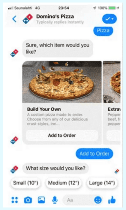
Domino’s bot appears on their website, mobile app, and Facebook Messenger. The interface uses a scrollable carousel to show menu items with photos.
When you pick a pizza, quick-reply buttons pop up asking what size you want. The combination of visual carousels and tap-to-choose buttons makes ordering fast and easy without typing.
2. PayPal Customer Support
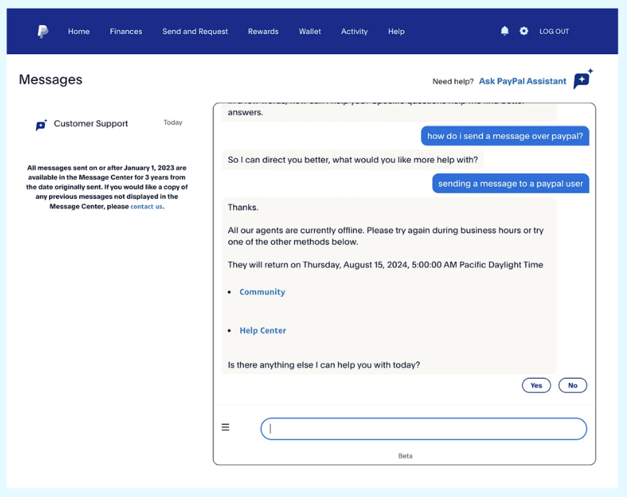
PayPal’s chatbot asks questions to understand your issue before suggesting solutions. When live agents are offline, it shows you exactly when they’ll be back.
The interface offers “Yes” or “No” buttons to confirm if you need more help. It also links to the Community and Help Center for self-service options. The clean layout with neutral colors makes everything easy to read.
3. Notion AI Assistant
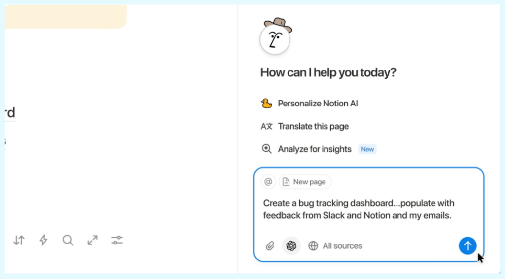
Notion AI integrates right into the productivity platform with a clean, minimal design. Icons like lightbulbs and pens guide you to actions like “Ask a question” or “Draft anything.” I appreciated how these visual cues removed all guesswork.
4. ChatGPT
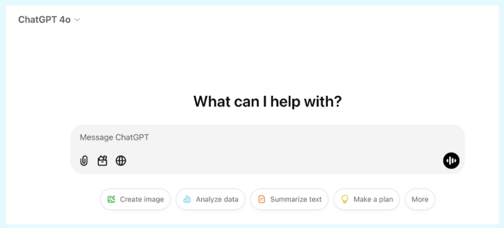
ChatGPT uses lots of white space and subtle branding to keep focus on the conversation. Suggested prompts like “Create image” and “Analyze data” help new users explore features. The interface supports voice input, file uploads, and standard text for flexibility.
What impressed me was how the friendly, approachable tone keeps interactions natural across coding help, creative work, and productivity tasks.
5. Meta AI (Instagram & WhatsApp)
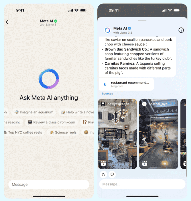
Meta AI, powered by Llama 3, works across Instagram and WhatsApp as a multi-purpose assistant. On Instagram, it shows curated reels and images with suggestions.
On WhatsApp, it offers playful prompts like “Imagine an aquarium” or “Help write a novel” to spark creativity. The input field and layout stay consistent across both apps for easy use.
6. Bank of America Erica
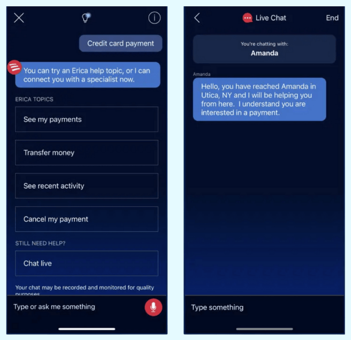
Erica works with both voice and text commands for tasks like checking your balance. The AI understands over 2,200 different ways people ask about balances. This depth stood out to me as serious natural language processing.
Financial info like spending habits appears as helpful images and graphics instead of plain numbers. You can also switch between voice and text anytime during the chat.
7. Home Depot Support Bot
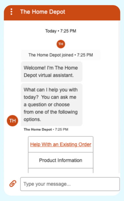
Home Depot’s bot starts with a simple welcome message and a menu of options. The most common request—”Help with an existing order”—sits at the top in a different color. This design choice felt smart because it saves most users time by addressing their issue right away.
8. Redfin Real Estate Assistant
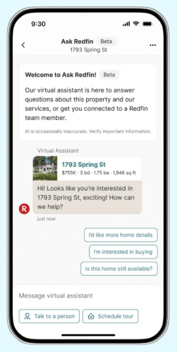
Redfin’s 24/7 virtual assistant helps homebuyers through the mobile app. The interface shows information-heavy property listings in a subtle color scheme that’s easy to scan.
Quick-reply buttons anticipate what you need next. Welcome messages add context to home listings. Clear call-to-action buttons let you “Talk to a person” or “Schedule a tour.” The design packs lots of info without feeling cluttered.
9. Expedia Virtual Agent
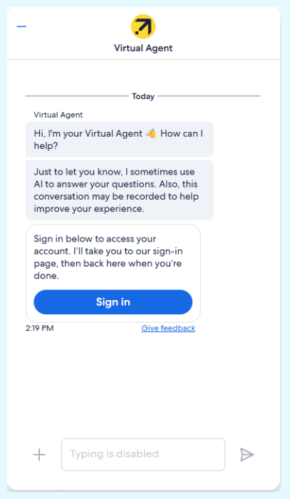
Expedia’s bot uses your name and references your upcoming trip for personalized help. When it can’t solve an issue, it offers to connect you with a human agent. This honesty impressed me.
Quick-reply buttons like “Sign In”, “Contact an agent” and “Not right now” save you from typing. The bot tells you about potential account problems before you ask. The text field disables when action buttons appear to keep interactions focused.
10. GoHenry Kids Money Bot
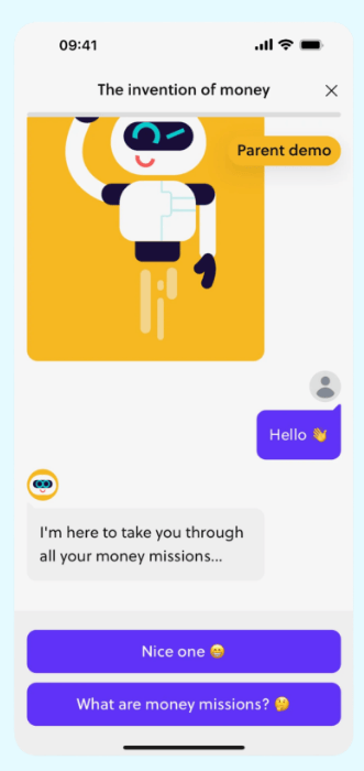
GoHenry’s chatbot teaches kids about money through “money missions” with bright colors and a cheerful animated robot. Quick-reply buttons like “Nice one 😁” make responses simple and fun.
The bot uses easy language that kids understand. What I noticed was how financial lessons come in small, engaging bites that make learning about money feel like a game.
11. ClickUp Task Assistant
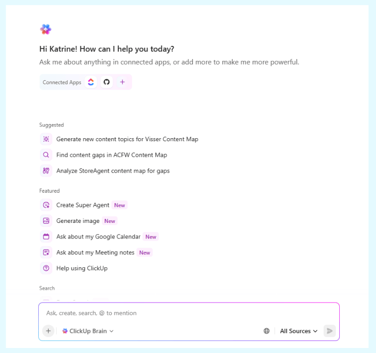
ClickUp’s bot suggests task-focused prompts like “What tasks am I working on?” and “What should I work on next?” It pulls information from tools like Confluence or Notion for cross-platform productivity.
This integration approach impressed me as thoughtful. Writing help for things like “product requirements document” speeds up workflows. The clean input bar at the bottom keeps everything organized and easy to use.
12. Slackbot
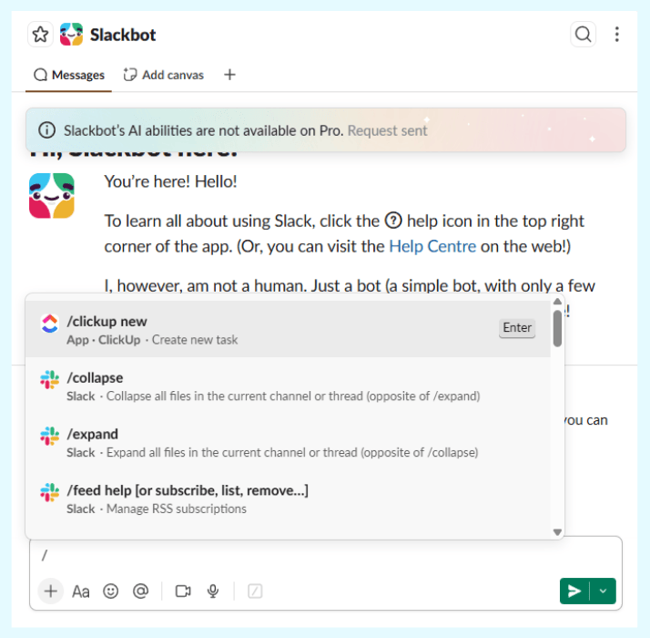
Slackbot works through command shortcuts like /shrug, /status, or /topic for quick team tasks. It handles reminders, user mentions, and updates with tagged usernames for clarity.
What I appreciated was how the familiar Slack layout keeps commands, text, and file sharing accessible.
13. Flo Health Assistant
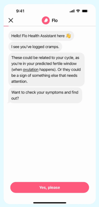
Flo references your logged data—like “I see you’ve logged cramps”—to personalize health guidance. This felt genuinely empathetic rather than robotic.
The bot suggests potential causes like ovulation with careful language: “These could be related to your cycle…” Follow-up prompts like “Want to check your symptoms?” appear with simple “Yes, please” buttons. The soft colors and rounded buttons also create a calming, supportive feel.
14. Snapchat AI
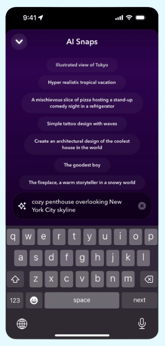
Snapchat’s AI bot generates creative prompts like “A mischievous slice of pizza hosting a stand-up comedy night in a refrigerator.” You can enter custom prompts like “cozy penthouse overlooking New York City skyline” for personalization.
Suggestions appear in a clean, scrollable list with star highlights for active selections. The dark background with bold text creates a sleek, modern look.
15. Canva Design Assistant

Canva’s bot guides you step-by-step through features like the Background Remover tool. It highlights key tools like Magic Studio and explains manual adjustments through the sliders icon.
What I found helpful was how the bot asks “How else can I help?” to keep the conversation open for more questions.
How StoreAgent Solves Chatbot UI For WooCommerce
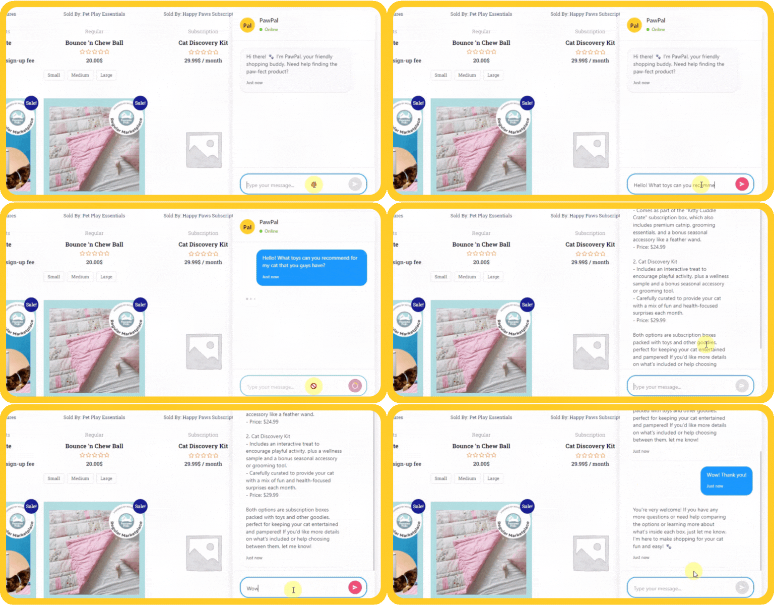
Most WooCommerce store owners aren’t designers. They worry about their chatbot looking messy or unprofessional.
Studying chatbot UI examples helps, but displaying product details, order status, and variations in a tiny chat window still seems complicated. Many don’t know where to start with the design.
However, StoreAgent AI Chat for WooCommerce solves these UI challenges with ready-made components.
Specific StoreAgent UI Features You Get
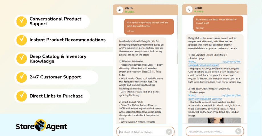
- Product Cards With Rich Media: Products appear with photos, current prices, and sale discounts right in the chat. The visual product cards increase click-through rates by making recommendations instant and clear.
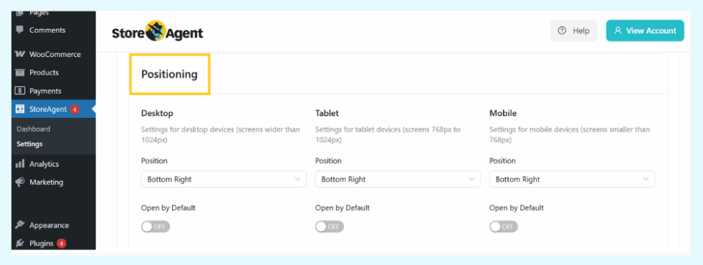
- Widget Position Control: You can set different positions for desktop, tablet, and mobile separately. This ensures your chat never covers critical site elements.
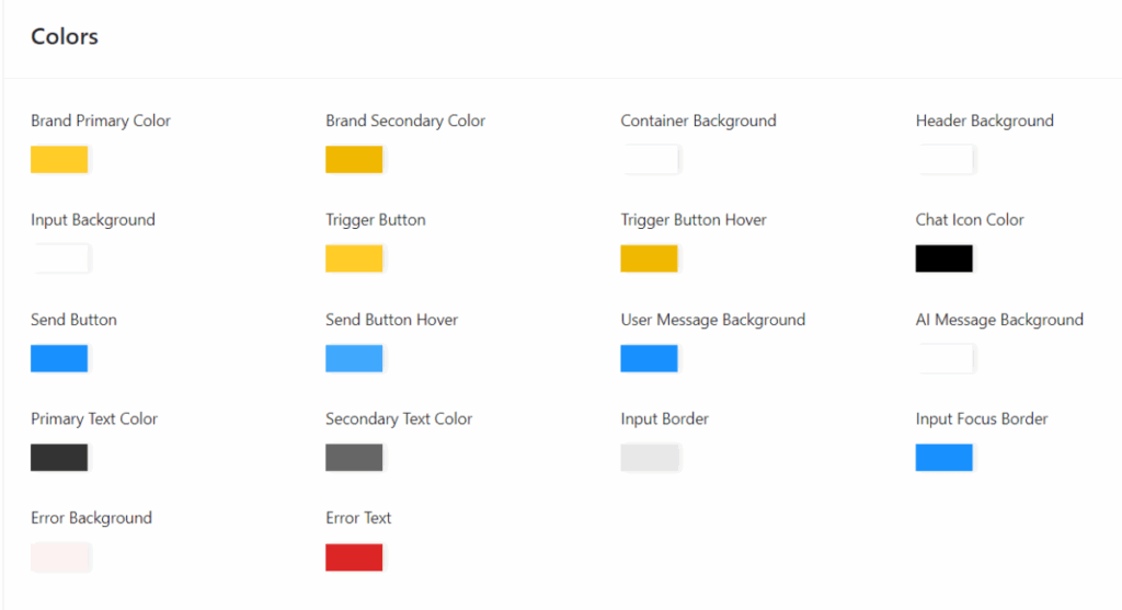
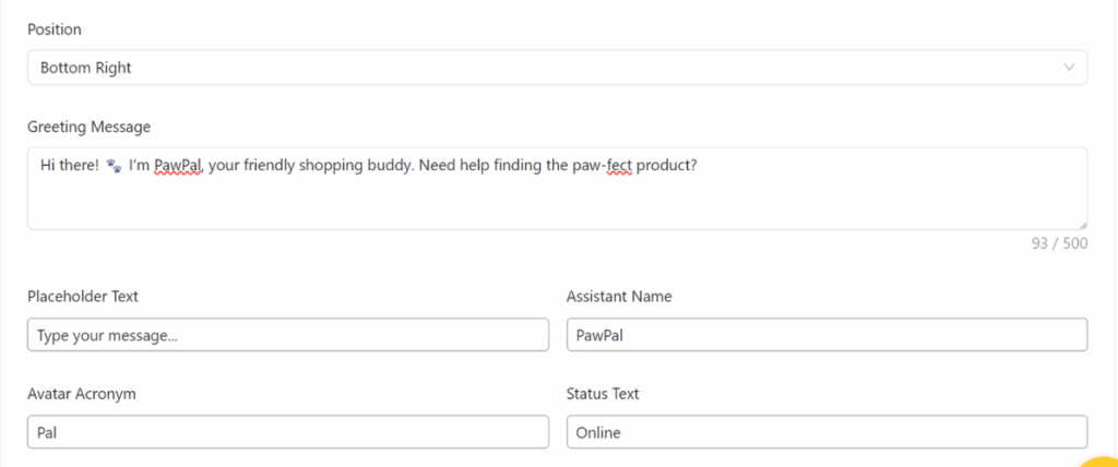
- Color Customization: Change colors, greeting messages, assistant names, and avatar text to match your brand. The customization takes minutes through simple dropdown menus.
- Communication Tone Settings: Choose from tones like Friendly, Conversational, or Informative. This controls how your bot talks to customers without writing custom scripts.
- Default Open Settings: Decide if the chat window starts open or closed on each device type. Desktop users might see it open for instant engagement, while mobile users see it closed to save screen space.
Smart Features That Work Behind The Scenes
The platform automatically shows relevant items with images and pricing. It can also fetch real-time order data after customers provide their order ID.
Beyond that, StoreAgent is a fully multilingual AI. It understands and responds in dozens of languages. This global-ready UI helps international stores provide seamless support.
Store owners also get advanced controls. You can embed StoreAgent Chat on your website and train it on your entire site’s content. This means the bot learns from your product pages, FAQs, policies, and other content to provide accurate answers.
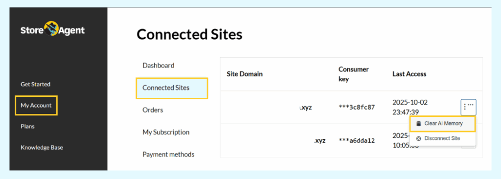
Additionally, you can clear AI memory from your account area under Connected Sites for better data management. You can also filter chat history by site when managing multiple stores.
StoreAgent AI Content Tools That Improve Chat Accuracy
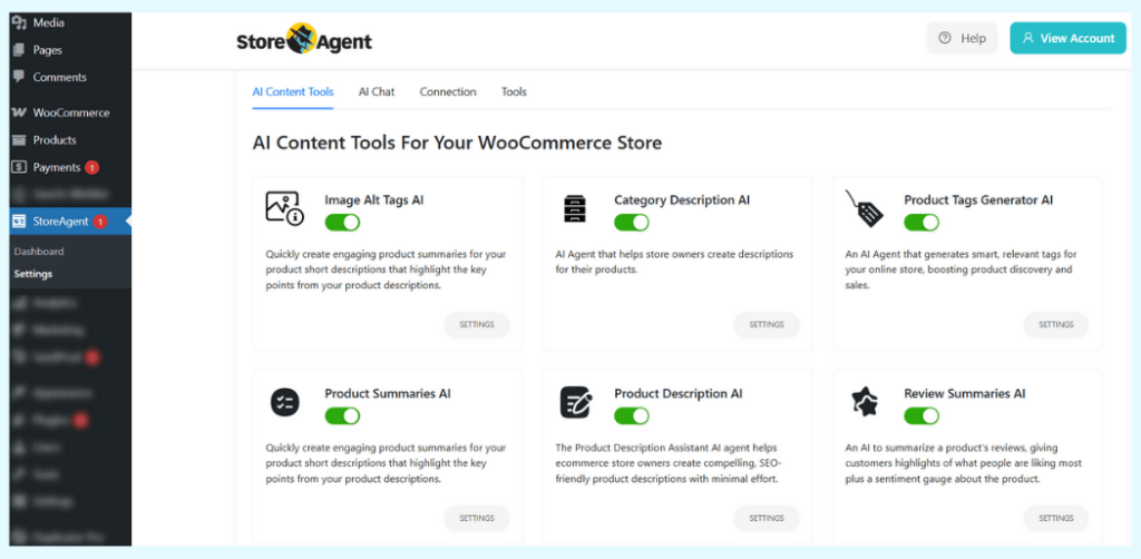
For better chatbot results, StoreAgent includes AI tools to complete your product data. The Product Tag Generator, Category Description AI, and Product Description AI, Image Alt Tags AI help fill out all product details. Richer product data leads to more accurate chatbot responses.
The platform also offers Review Summaries AI to synthesize customer feedback. More complete product information means your chatbot can answer questions better and feel smarter to customers.
Final Thoughts
The chatbot UI examples above show that the best designs focus on user needs, not flashy extras. The key is matching your UI to what your customers expect and need.
To get the most from this guide, revisit:
- Why chatbot UI design matters
- What UI elements make chatbots work better
- 15 real chatbot UI examples from top brands
- How StoreAgent solves chatbot UI for WooCommerce
Don’t let poor design hurt your conversions. Get a chatbot that looks professional from day one with StoreAgent. Explore plans today starting with our free option.
Frequently Asked Questions
What is the ideal chatbot widget size for mobile?
Mobile chatbots should take up 60-80% of screen height when open. The width should be 90-95% of the screen. When closed, the chat button should be 50-60px wide so people can tap it easily without blocking other content.
Do chatbot colors affect conversion rates?
Yes, chatbot colors impact conversions when they match your brand and use color psychology. Blue builds trust for banking. Green feels helpful for support. Orange and red create urgency for sales. Use contrasting colors for action buttons so they stand out.
Should chatbots open automatically or stay minimized?
Auto-open chatbots grab attention but can annoy visitors who are browsing. Minimized widgets let people explore your site first and open the chat when ready. E-commerce stores work better with minimized chats. High-intent pages like pricing can use auto-open.
How do I test chatbot UI effectiveness?
Track these four metrics: how many people use it, how many finish conversations, how fast issues get solved, and how many convert. Heatmaps show where users click. Session recordings show where they get stuck or confused.
